Brand guidelinesVersion 01 · August 2026

Common Ground
Good things grow here.
StrategyIdentityExpression
Prepared by We Solve Media · hello@wesolvemedia.comThe Common Ground team · hello@commonground.co.nzcommonground.co.nz
Good things grow here.
Using this guide
Contents
This guide brings strategy, language and visual expression into one practical reference. Start with the quick reference, then use the detailed sections when creating or reviewing work.
Review this guide whenever the offer, audience or market changes. Record major decisions as a new version rather than quietly overwriting the rationale.
Quick reference
Brand at a glance
Good things grow here.
Guidelines: We Solve Media · hello@wesolvemedia.com
Brand foundation
The idea at our centre
Common Ground began with a simple belief: neighbourhood life is better when people have an easy place to meet, learn and grow. Coffee, plants and practical knowledge come together here as small everyday invitations to feel more connected to place, season and one another.
Bring people closer to their neighbourhood, the seasons and each other through thoughtful everyday experiences.
Neighbourhoods where gathering locally, growing something and sharing useful knowledge feel like natural parts of daily life.
Seasonal food, thoughtfully sourced coffee and a small edit of plants, tools and practical workshops.
Design-aware locals, young families and weekend gardeners who value quality without pretence.
Coffee, plants and practical knowledge brought together in one genuinely welcoming local place.
Audience profile
The people we are here for
Audience insight should shape what we say, what we prioritise and how easy we make the next step.
Design-aware locals, young families and weekend gardeners who value quality without pretence.
Lead with the pleasure and usefulness of the visit, make quality easy to understand and offer one simple reason to stop by soon.Local growers, makers and community groups looking for a thoughtful place to collaborate and connect.
Show how local growers, makers and groups can share knowledge, host something useful and reach neighbours who care about considered choices.Use familiar, neighbourly language. Explain gardening ideas without specialist jargon and describe quality through specific choices rather than status. Prefer welcome, useful, local, grow; avoid unexplained jargon and insider language.
Brand positioning
Our place in the market
For locals who want quality without pretence, Common Ground is the neighbourhood café and garden store that makes everyday rituals more connected, useful and rewarding.
Coffee, plants and practical knowledge brought together in one genuinely welcoming local place.
Every visit leaves you feeling more connected and ready to grow something good.
Describe the category in terms customers already understand before introducing what makes us different.
Support price with specific value, experience and proof. Never imply “cheap” unless that is an intentional position.
Hospitality and garden retail in one experience
A useful, edited range
Local workshops and shared knowledge
Compared with: Independent cafés, garden centres, lifestyle retailers and online plant stores.
| Choose Common Ground | When fit, trust and a distinctive experience matter. |
|---|---|
| Choose a category alternative | When familiarity or a specific feature matters more. |
| Choose a low-cost substitute | When price is the only priority. |
Brand personality
How the brand behaves
Personality turns an abstract strategy into consistent choices. It should guide language, service, design and behaviour.
Use this character as a guide, not a costume. Keep the brand specific to its customers and business category.
Be warm by making every invitation generous, specific and free of pressure.
Stay grounded in real products, useful knowledge and credible everyday moments.
Express optimism through achievable next steps rather than exaggerated promises.
Warm · Grounded · Optimistic
Specific · Considered · Consistent
Vague · Performative · Generic
Overbearing · Cold · Complicated
Relaxed, hopeful and quietly energising
Welcomed, capable and inspired to take one small positive step
Chosen brand direction
The idea we are developing
Make every touchpoint feel like stepping into a familiar local place: warm, useful and quietly alive with the season.
It gives equal weight to hospitality and garden retail, presenting the combined offer as one coherent neighbourhood experience rather than two adjacent businesses.
Design-aware locals receive the quality and calm they value, while families and newer gardeners feel welcomed rather than tested on what they know.
The system owns the useful overlap between a good local café, an edited garden store and practical shared knowledge.
Its strong wordmark, natural imagery and simple hierarchy move confidently from a laptop and social post to printed pieces, signage and vehicle livery.
Forest Floor gives “Rooted Welcome” a consistent hierarchy across the current primary, background, accent and supporting colour roles.
Fraunces and Manrope bring editorial warmth to “Rooted Welcome” while keeping everyday copy easy to read.
Use generous rectangular fields, fine botanical linework, restrained rules and softly irregular natural edges within a disciplined grid.
This route most clearly connects the brand promise, the mixed café-and-garden offer and the audience need for quality without pretence.
Clear · Neighbourly · Quietly confidentLogo system
Our signature
The logo system makes the brand recognisable at every scale. Use the primary logo first, then choose the simplest approved variant that fits the space.
Use the horizontal/wordmark treatment in wide headers and signage. Use the stacked or submark treatment in square spaces. Preserve uploaded artwork as supplied; use an approved reversed file on dark backgrounds rather than automatically recolouring an opaque logo.
Logo usage
Protect recognition
Consistency matters more than decoration. Keep the logo intact, legible and visually separate from surrounding content.
Keep at least one submark-width on every side. No text, imagery, borders or page edges should enter this zone.
24 pxStarting minimum: 24 px high digitally or 12 mm in print. Increase it if fine detail begins to disappear.
Light background · Warm IvoryUse the Deep Pine version.
Primary background · Deep PineWhite is recommended here. Supply an approved transparent master for production.
Accent background · AmberUse a black one-colour treatment here. Supply an approved transparent master for production.
Prefer top-left, centred or bottom-left placement. Use one logo per surface unless repetition has a functional purpose, such as a multi-page document footer.
Logo file guide
Choose the right asset
Always begin with the supplied master files. Converting a small raster file into another format does not improve its quality.
Scales cleanly for websites, interfaces, signage artwork and digital templates. Keep transparency where supplied.
Use at the intended size for presentations, social assets and office documents. Best when a transparent background is needed.
Use an optimised copy when page speed matters. Keep SVG for the logo whenever the platform supports it.
Use for simple sharing where transparency is not needed. Avoid for small logos because compression can soften edges.
Send the original vector artwork to printers and fabricators. Do not open and resave unless production requires it.
Use CMYK vector artwork and request a proof. Confirm spot-colour or Pantone matching with the printer when colour fidelity matters.
Use RGB SVG first, then transparent PNG or WEBP at the exact required pixel dimensions.
common-ground-logo-[lockup]-[colour]-[rgb|cmyk]-v01.ext
Choose transparent files over white-box versions unless a controlled background is part of the approved artwork.
Colour system
Our palette
Deep Pine gives the identity dependable structure, Warm Ivory keeps it welcoming, Amber guides attention and Soft Sage adds a quiet seasonal layer.
RGB 23 / 63 / 53
CMYK 63 / 0 / 16 / 75
RGB 244 / 239 / 227
CMYK 0 / 2 / 7 / 4
RGB 229 / 168 / 75
CMYK 0 / 27 / 67 / 10
RGB 184 / 197 / 167
CMYK 7 / 0 / 15 / 23
Suitable for normal text at AA contrast.
Suitable for normal text at AA contrast.
HEX and RGB are for screens; CMYK values are starting points for print. Match Pantone colours from a physical swatch with the production partner—never guess them from a screen.
Typography
Our type system
AaFraunces brings warmth and character to memorable messages, while Manrope keeps practical information, navigation and calls to action clear.
Aa Bb Cc Dd Ee
0123456789
ABCDEFGHIJKLMNOPQRSTUVWXYZ
abcdefghijklmnopqrstuvwxyz
0123456789 !?&@
Body / 11–16 / 1.55 · Caption / 9–12 / 1.4 · Button / 12–14 / 1.0
Headings: Georgia, serif
Body: Arial, sans-serif
Headings 500–700
Body 400 / 600 / 700
Headings −2% to −5%
Body 0% · never tightly tracked
Confirm current desktop, web, app and sharing rights before handover. Keep licence records with the asset pack.
Tone of voice
How we sound
Our voice is clear, neighbourly, quietly confident. It makes expertise easy to act on and confidence feel earned.
Be clear: lead with the useful point and make the next step easy to see.
Be neighbourly: sound like a thoughtful local sharing something worth knowing.
Be quietly confident: use specific detail and let the experience prove the claim.
Write with professional care, then remove anything a real person would not naturally say.
welcome · useful · local · grow · together · seasonal
exclusive · best-in-class · solutions · discerning · luxury
“Good things grow here.”
Plan your visit →
“We offer premium, best-in-class solutions for discerning customers.”
Messaging framework
What we want people to remember
Adapt the message to the moment without changing the meaning. Lead with the audience outcome, then explain the offer and why it is believable.
Messaging in action
Ready-to-shape examples
These are first-draft models, not scripts. Adapt details to the channel and verify every factual claim before publishing.
Pause for thoughtful coffee, find something useful for the garden and leave with one practical idea worth trying.
Plan your visit →A healthy herb pot starts with the right light, patient watering and room for the roots to breathe. Save this for the weekend, then ask us what will suit your space.
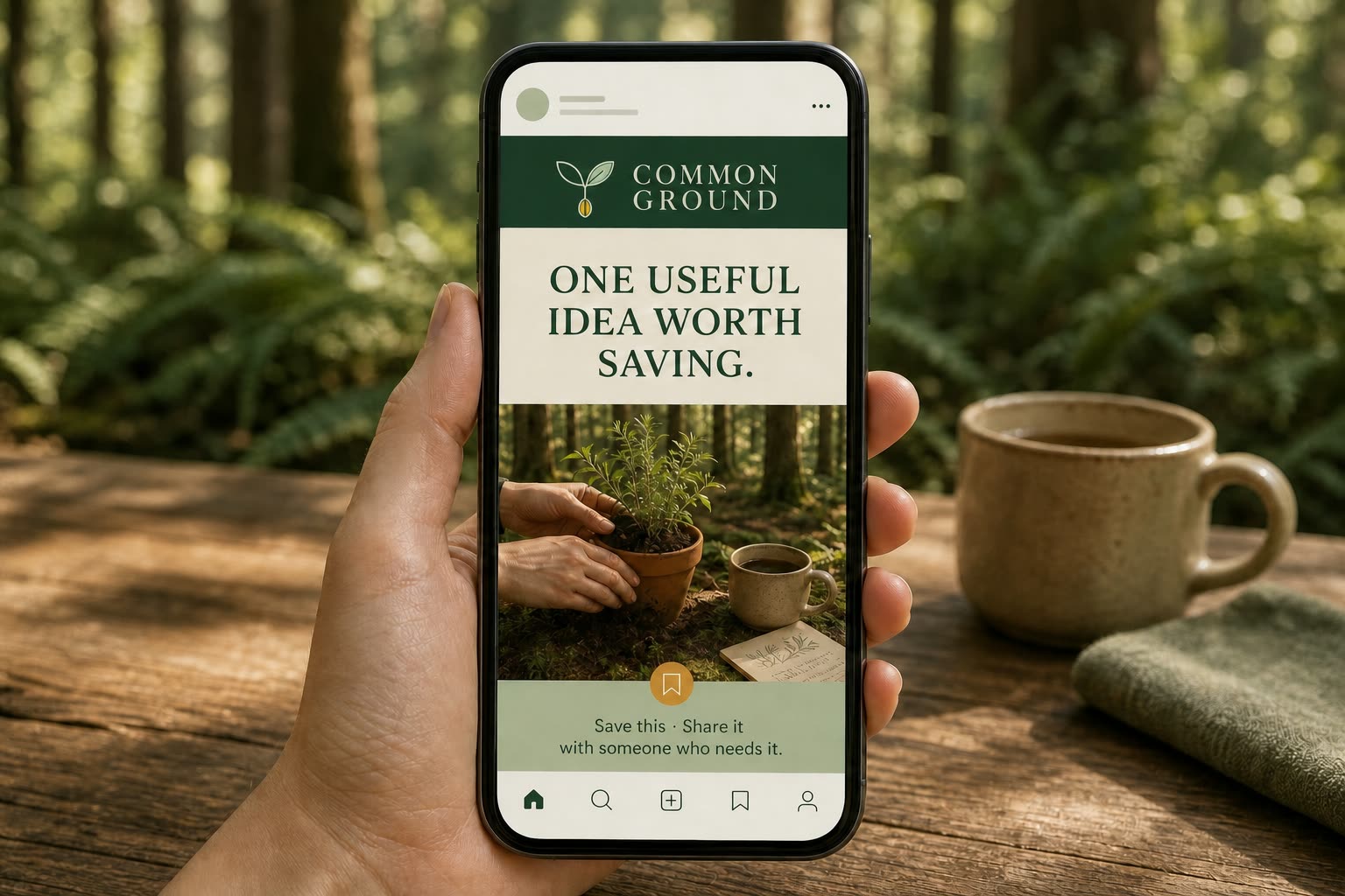
Save this. Share it with someone who needs it.A useful idea for the season ahead
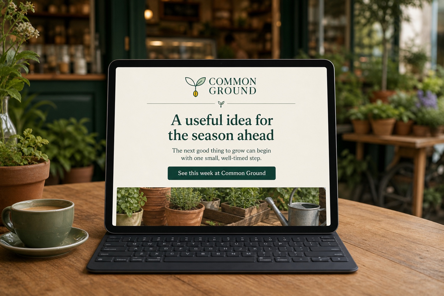
The next good thing to grow can begin with one small, well-timed step. Here is one useful garden idea to try this week.
See this week at Common Ground →Seasonal food, thoughtfully sourced coffee, useful plants and practical workshops for locals who value quality without pretence.
Not at all. Tell us about your space and what you would like to grow, and we will help you choose a manageable next step without the jargon.
Common Ground is a neighbourhood café and garden store for locals who value quality without pretence. It brings together thoughtful coffee, useful plants and practical knowledge in one genuinely welcoming place. Learn more at commonground.co.nz.
Verify sustainability, sourcing, health and product-performance claims before publication. Use evidence close to the claim, record its source and review regulated content with an appropriately qualified adviser.
Visual identity
Your brand in action
The identity balances deep green structure, generous ivory space, warm natural materials and editorial type so every expression feels welcoming, useful and unmistakably connected to growth.
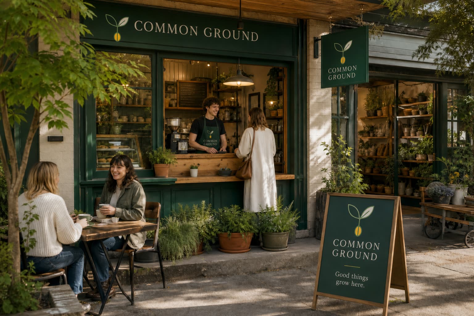
Warm, natural-light editorial photography of real café and gardening moments, with tactile wood, ceramic, paper and foliage; observed rather than staged, calm but never empty.
Use generous rectangular fields, fine botanical linework, restrained rules and softly irregular natural edges within a disciplined grid.
Welcomed, capable and inspired to take one small positive step
Photography direction
The world through our lens
Photography should make Common Ground feel lived in: a calm local place where coffee, plants, useful work and neighbourly conversation naturally meet.
 ReadyHero · Natural light
 ReadyDetail · Useful detail
 ReadyPeople · People in place
Real café and garden-store moments, tactile products, seasonal details and people learning or sharing knowledge in a credible neighbourhood setting.
Use one clear focal subject, warm natural light, layered greenery and intentional negative space. Keep enough environmental context to connect café and garden.
Natural, directional light with honest warmth and visible material texture. Let Deep Pine and Warm Ivory lead through surfaces and styling; reserve Amber for focal details and use Soft Sage sparingly.
Relaxed, hopeful and quietly energising. Expressions should feel observed and credible, never forced.
Use AI imagery only when its purpose is clear and rights, consent and disclosure requirements are understood. Prompt for the approved composition, light, palette and mood; check hands, text, products, cultural details and factual context before use. Never fabricate a customer, result or documentary moment.
Icons & graphics
Support, don’t decorate
Icons, illustrations and graphics should make information easier to understand. Keep construction consistent so every element feels like part of one family.
Simple outline icons with gently rounded joins. Use filled icons only for selected or high-priority states.
Scale stroke optically; avoid mixing delicate and heavy icons.
Match the broader shape language and repeat the same angles, joins and radii.
Use Deep Pine by default and Amber only for emphasis.
Use simplified forms, limited palette and one consistent perspective. Let the idea lead; avoid mixing unrelated illustration styles.
Repeat the core motif at measured intervals. Keep contrast low behind text.
Use Warm Ivory for structure, Deep Pine for labels and Amber for the single point that needs attention. Label data directly.
Use one reading direction, short labels and consistent connectors. Texture and overlays must never carry essential meaning.
Layout system
A repeatable rhythm
The grid keeps the brand recognisable across website, print and social work. Break it only when the hierarchy becomes clearer.
Supporting information sits on the same grid, with enough space to feel deliberate.
Desktop / print. Collapse to 6 on tablet and 4 on mobile.
Keep critical content inside a consistent safe area.
Align related content to shared edges. Centre only for deliberate emphasis.
Protect hierarchy; do not fill every gap with decoration.
If two things compete for first place, simplify.
Digital usage
Designed for interaction
Digital experiences should feel fast, useful and unmistakably on-brand. Every component needs a purpose, a readable state and a clear next step.
Keep navigation short. Use one primary action and alternate Warm Ivory/white sections only when it helps orientation.
Use short, action-led labels. Include clear hover, focus, disabled and loading states.
Show persistent labels, plain-language help and specific errors. Never use placeholder text as the only label.
Use a simple logo, one-column newsletter, live text and a complete signature: name, role, email, phone and website.
Check safe zones, contrast and legibility at the final size and on the final device.
Use the simplest approved mark. Test it at 16 px.
Repeat the promise and “Plan your visit”. Remove distractions.
Print usage
Made tangible
Print is where colour, stock and finish become part of the brand experience. Keep the hierarchy simple and involve the production partner early.
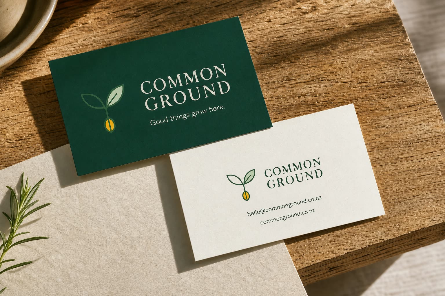
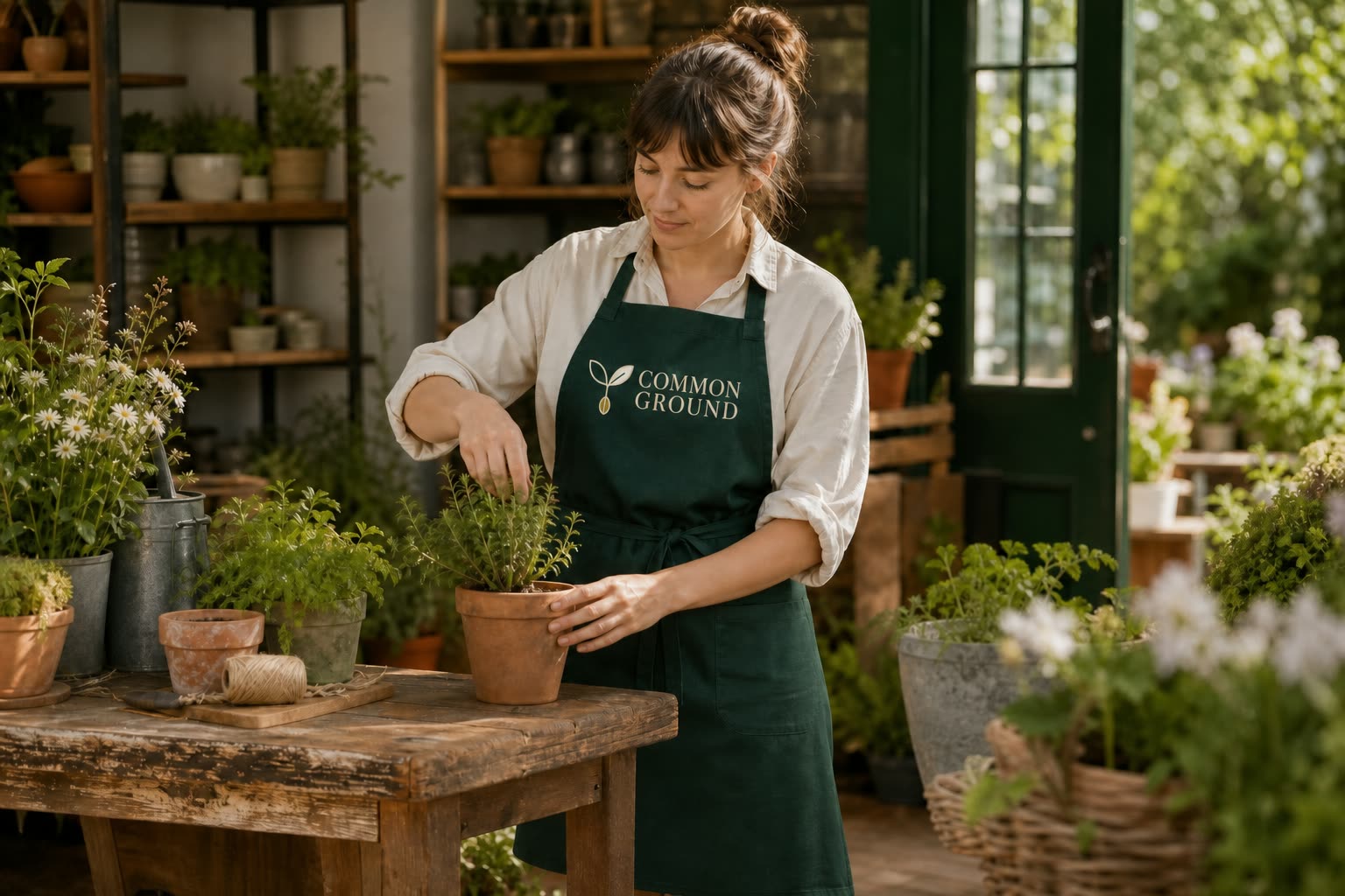
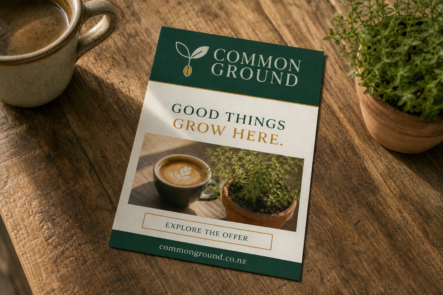
Make the business name easy to recognise on the front. Keep the reverse calm, readable and limited to useful contact details.
Choose one clear logo placement and test it at real size. Confirm fabric, embroidery or transfer colour before ordering.
Lead with one relevant promise, one supporting image and one next step. Keep essential details inside the safe area.
Confirm with the printer.
Keep live content inside.
At final placed size.
Review critical jobs physically.
Social & advertising
Recognition in the feed
Make each post worth pausing for. A recognisable system gives the message consistency while the content does the useful work.
Product & packaging
On shelf and in hand
Packaging should make the product easy to recognise, understand and choose—then reward a closer look with thoughtful detail.
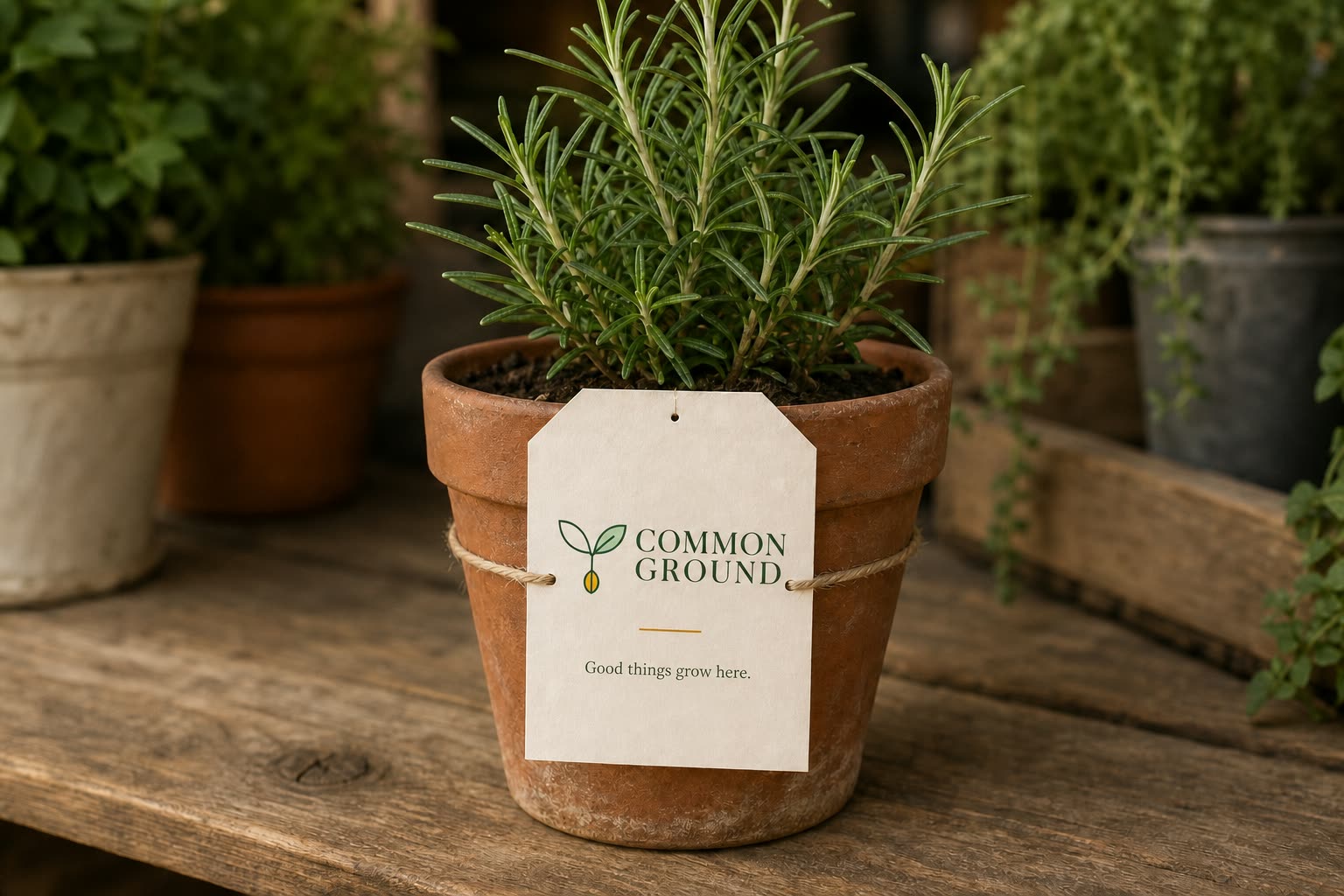
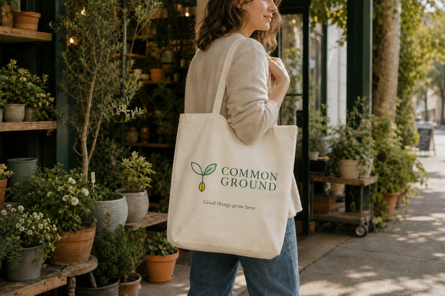
Keep the brand block and hierarchy consistent, then change only the content that distinguishes each product or variant.
Use one clear logo placement with a short message. Check artwork size, print method and contrast on the chosen fabric.
Reserve an uninterrupted panel for ingredients, warnings, business details and any category-specific mandatory text. Obtain specialist review.
Use a quiet, high-contrast zone with required clear space. Test the final printed size and material before production.
Show accurate scale, colour and contents. Avoid props that could be mistaken for what is included.
Review dielines, folds, seals, stock, fabric, ink coverage and finish with the supplier. Approve a physical proof.
Website application
Website · clear and useful
Help the right people understand Common Ground, trust the offer and know what to do next without having to decode the page.
 Visit · Plants and workshops · Ideas
Pause for thoughtful coffee, find something useful for the garden and leave with one practical idea worth trying.
First-screen message
Lead with the customer outcome, explain the offer plainly, add credible proof and repeat one primary action at useful moments.
Keep navigation short, type readable, focus visible and forms simple. Do not rely on colour, motion or imagery alone.
Test links, forms, speed, search previews and every important device size. Verify claims, contact details and accessibility.
Keep navigation focused on Visit, Plants and workshops, Ideas. Use See what is in season only when it supports the main action rather than competing with it.
Social media application
Social media · ready to edit
Use this example as a starting point for Common Ground. Make the headline and caption sound like your business, check every fact, then choose one simple next step.
Email application
Email · ready to edit
Give Common Ground one useful reason to appear in the inbox. Keep the promise honest, the message focused and the next step easy to understand.
Words for the first email
Match the subject line to the message, lead with what matters to the reader and keep one main action.
Use a single column, live text, descriptive links and useful image descriptions. Keep essential meaning out of the image.
Test the sender name, subject, links and mobile layout. Confirm consent, an unsubscribe route and every factual claim.
Use hello@commonground.co.nz as the checked reply or contact route. Send a test to a phone before sending it to customers.
Print collateral application
Print collateral · ready to brief
Turn Common Ground into something useful people can hold, keep or pass on. Let the format serve one audience and one clear purpose.
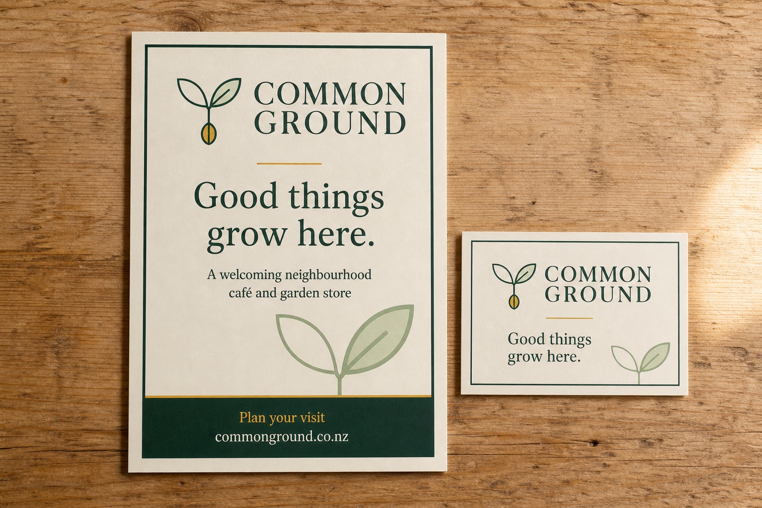
Message hierarchy
Lead with one headline, make the value easy to scan, add proof where it helps and finish with one contact route.
A handout, brochure and poster do different jobs. Choose the size, reading distance and amount of detail before designing.
Confirm final size, bleed, safe margins, image quality and colour setup. Check phone numbers, URLs, claims and any QR code.
Use commonground.co.nz only after it has been checked. Approve a physical or full-size proof before ordering the complete print run.
Packaging application
Packaging · ready to shape
Use the brand to make the product feel familiar at first glance, then give people the practical information they need to choose with confidence.
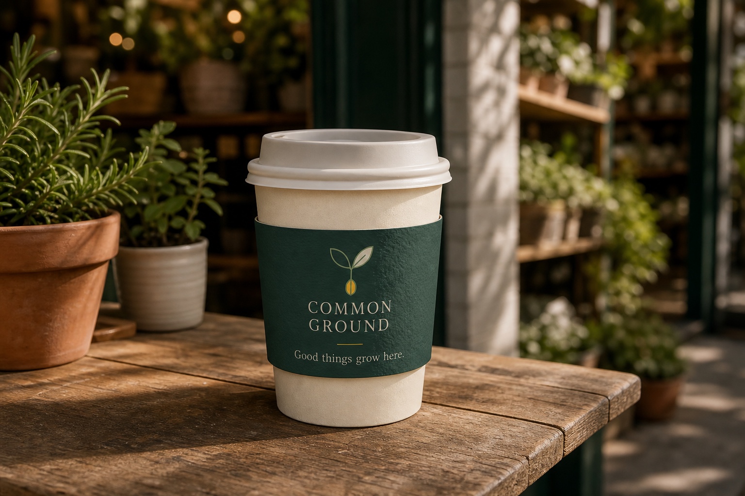
Front-of-pack priorities
Keep brand, product, variant and benefit in that order. Do not let decoration compete with required information.
Plan space for ingredients, warnings, quantity, business details, barcode and any category-specific information.
Confirm the supplier dieline, folds, seals, material, ink coverage and finish. Test the barcode and approve a physical proof.
Treat the image as a direction, not finished packaging artwork. Confirm every product fact and legal requirement with the appropriate specialist.
Signage application
Signage · ready to brief
Help people recognise Common Ground before they arrive. Keep the sign or vehicle simple enough to understand at real-world distance and speed.
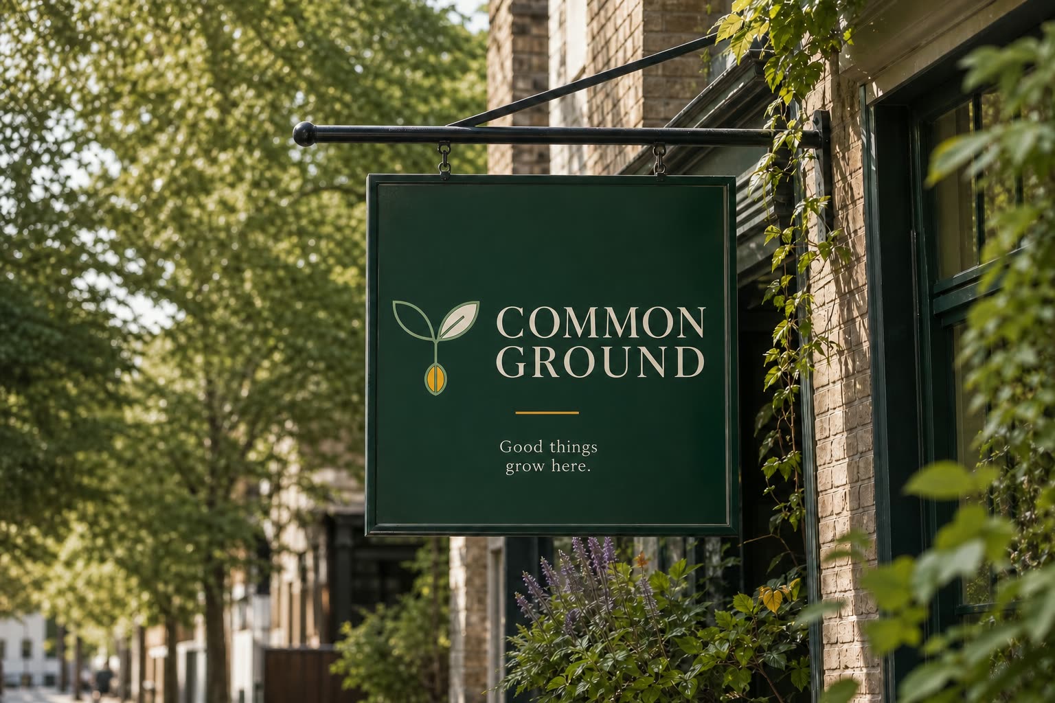
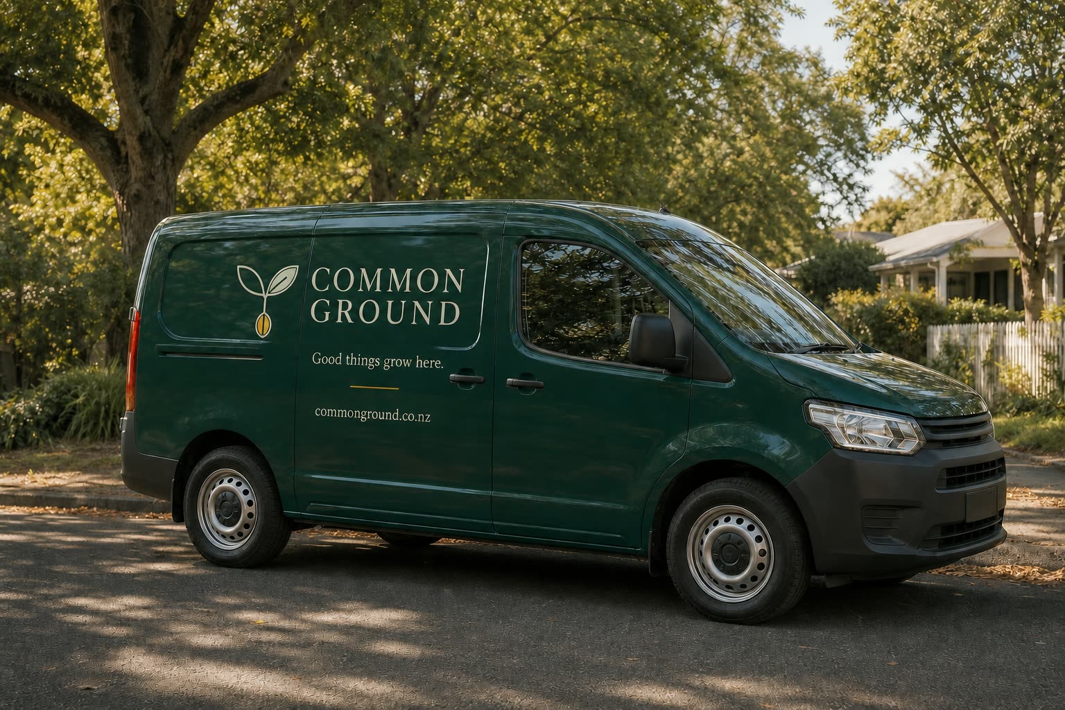
What must be readable
View the design small, far away and in motion. The business name should remain recognisable before any supporting detail.
Confirm materials, lighting, mounting, scale, placement and vehicle contours with the signwriter before artwork is final.
Verify the supplied logo, colours, spelling and every applied detail. These concepts guide production; they are not fabrication files.
Check site visibility, landlord or council requirements and vehicle safety. Approve scaled artwork and material samples before manufacture.
Merchandise application
Merchandise · ready to apply
Choose an item people will genuinely use, then apply Common Ground with enough restraint that the result feels considered rather than promotional.
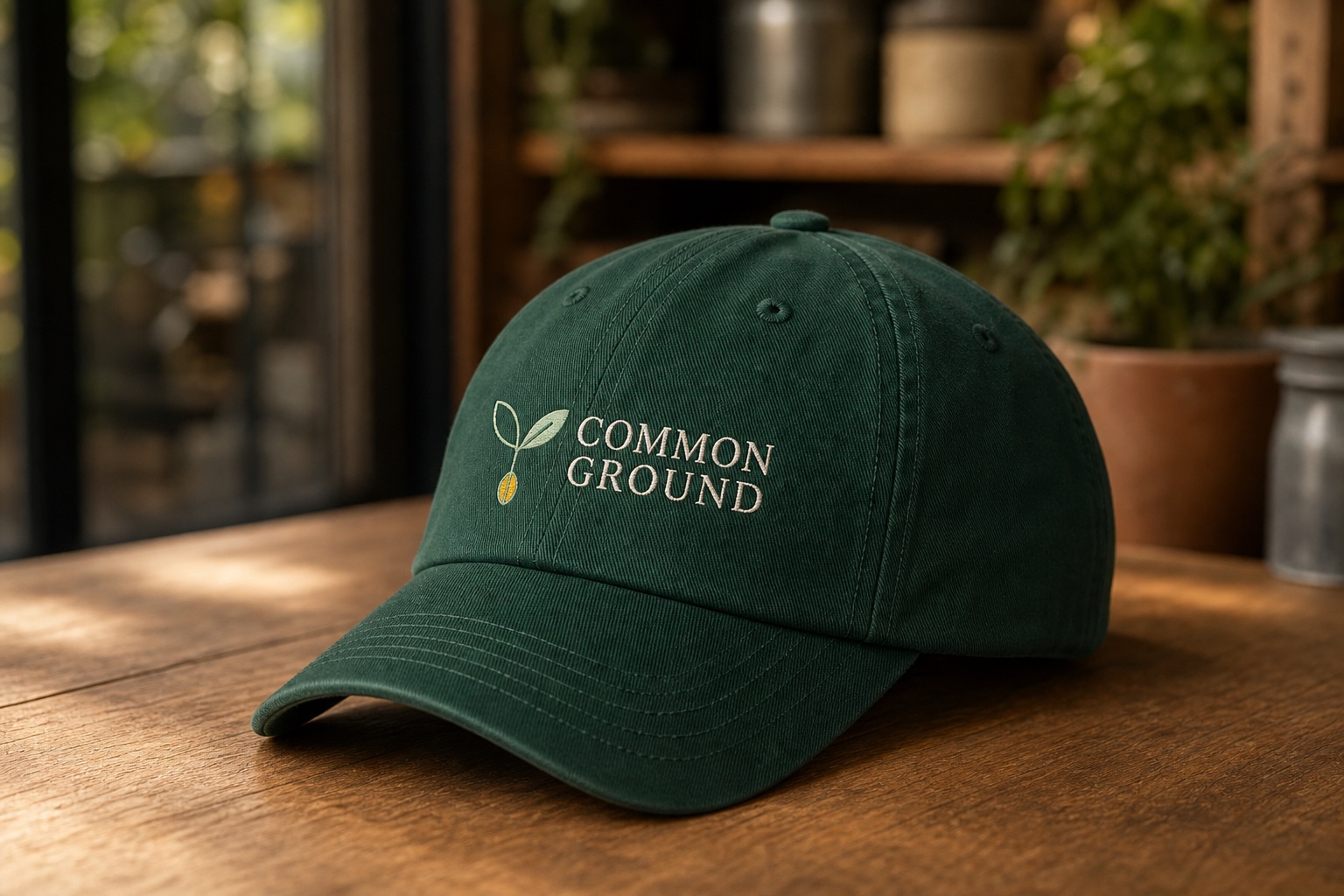
What belongs on the item
Choose for usefulness, fit and durability first. The best merchandise earns repeat use without needing a loud design.
Use one clear logo or name placement and one short message at most. Check scale and contrast from normal viewing distance.
Match artwork to embroidery, screen print or transfer limits. Review material, colour, placement, wash performance and a finished sample.
Confirm sizes, quantities and decoration method with the supplier. Verify any environmental or material claim before putting it on the item.
Accessibility
Designed to include
Accessibility is part of brand quality. Aim for WCAG 2.2 Level AA in digital work and test with people, devices and assistive technology—not only automated tools.
Deep Pine on Warm Ivory · 10.2:1 · AA for normal text
Warm Ivory on Deep Pine · 10.2:1 · AA for normal text
Deep Pine + Amber · 5.6:1. This pairing also reaches AA contrast for normal text.
Target 4.5:1 for normal text and 3:1 for large text and essential interface boundaries. Check every real combination.
For digital body copy; allow zoom and text resizing. Use at least 9 pt for most print body copy, larger for long reading.
Use descriptive headings, manageable line lengths, plain language and meaningful link text.
Keep keyboard focus visible, provide pause controls and respect reduced-motion preferences.
Describe the image’s purpose in context. Leave decorative images empty; do not repeat nearby copy. For complex charts, provide the key takeaway and underlying data.
Prefer “View workshop dates” or “Download the pricing guide” over “Click here”. The action should still make sense out of context.
Pair colour with text, icons, patterns or position for status, errors, categories and chart series.
Test contrast, keyboard navigation, zoom, reflow, forms, headings, screen-reader names, captions and PDFs before launch. Accessibility conformance depends on final implementation and content.
Brand assets
The handover
This handover gives you the core brand materials needed to use the identity consistently today, with natural next steps to extend the system over time.
Approved logo artwork for consistent everyday use
SVG · PNG · PDF/EPSIncludedFraunces, Manrope and licensing information or files where licensing permits
Files or official linksIncludedHEX, RGB, CMYK and approved colour guidance
ASE · PDF · TXTIncludedThis editable, print-ready brand guidelines document
PDF · editable sourceIncludedDevelop social media templates for posts, stories, covers and profile applications so the brand can show up consistently across each channel.
Commission a considered set of icons, patterns and photography to give the identity more texture, recognition and range.
Extend the system into mockups, website assets and print collateral when those real-world applications are ready to develop.
Do’s & don’ts
The everyday quality check
Use these principles when reviewing new work. If an execution follows the rules but feels wrong, return to the audience, promise and personality.
Use approved artwork with clear space and strong contrast.
Redraw, distort, decorate or place it on clutter.
Let Warm Ivory and Deep Pine lead; use Amber to guide attention.
Use every colour equally or rely on colour alone.
Use the defined hierarchy, comfortable spacing and approved weights.
Add novelty fonts, shrink body copy or overuse all caps.
Choose specific, credible moments with one clear subject.
Use generic stock gestures, heavy filters or misleading scenes.
Be clear, neighbourly, quietly confident; lead with useful meaning.
Use hype, unsupported claims or jargon the audience must decode.
Build one focal point, align deliberately and preserve whitespace.
Compete for attention, crowd edges or centre everything by default.
A simple final check
These guidelines are a living system. Use them with intent, learn what resonates and keep evolving with care.